Project Overview
Problem
As science and technology increasingly shape our everyday lives, understanding basic scientific concepts and staying informed about new developments is more important than ever. Yet, traditional media often presents scientific information in ways that feel dense, jargon-heavy, or disconnected from daily life—making it challenging for the general public to engage. This gap contributes to low science literacy, limiting people’s ability to make informed decisions, participate in meaningful discussions, and fully appreciate the role of science in society.
Solution
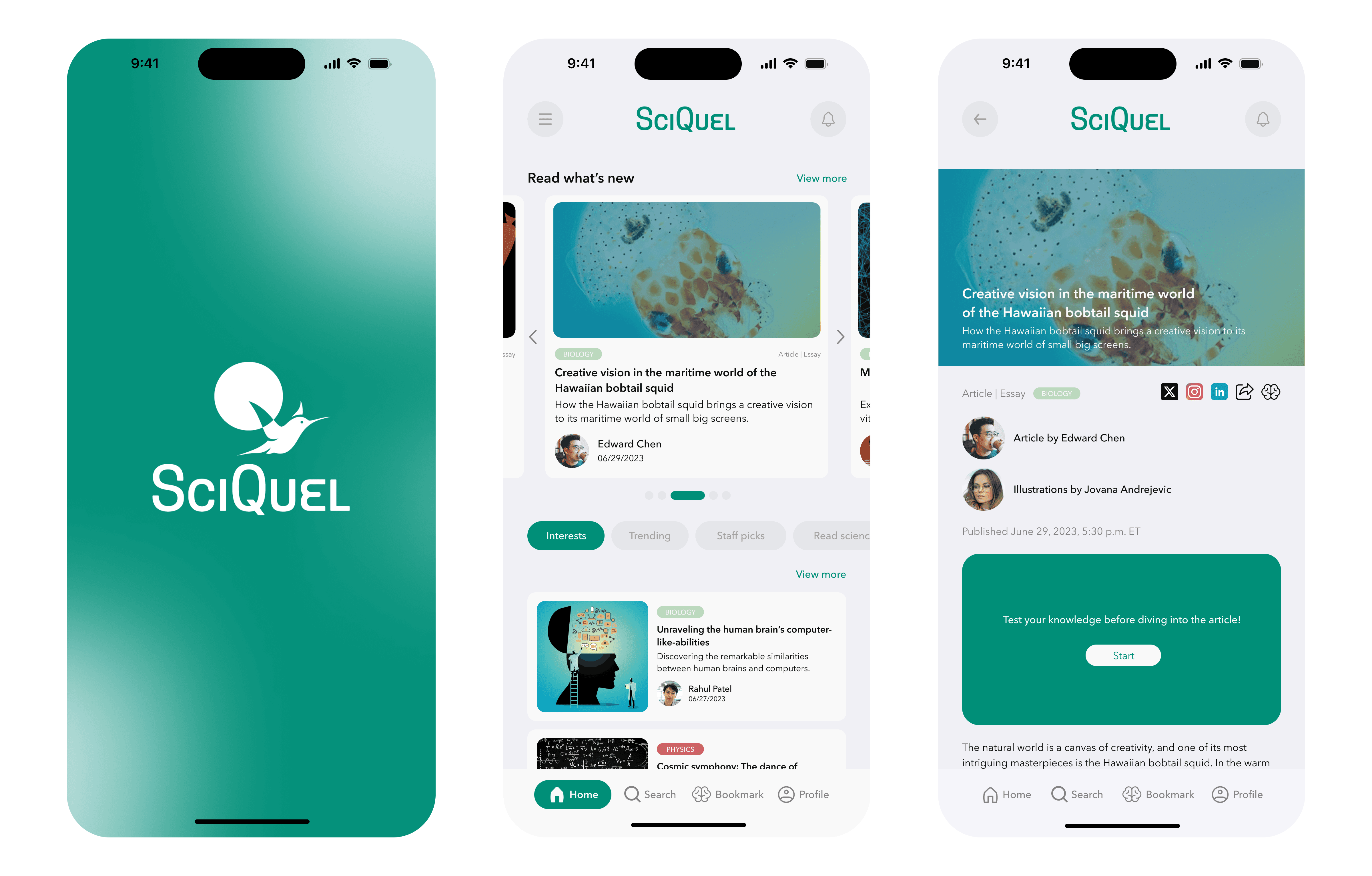
I designed SciQuel, a science news media app, that makes scientific content accessible, engaging, and relevant. The platform curates trustworthy sources, simplifies complex concepts, and uses clear visuals to enhance comprehension. By delivering context-rich, visually engaging, and easy-to-digest content, the app aims to foster curiosity, improve science literacy, and encourage users to explore the world of science with confidence.
Product

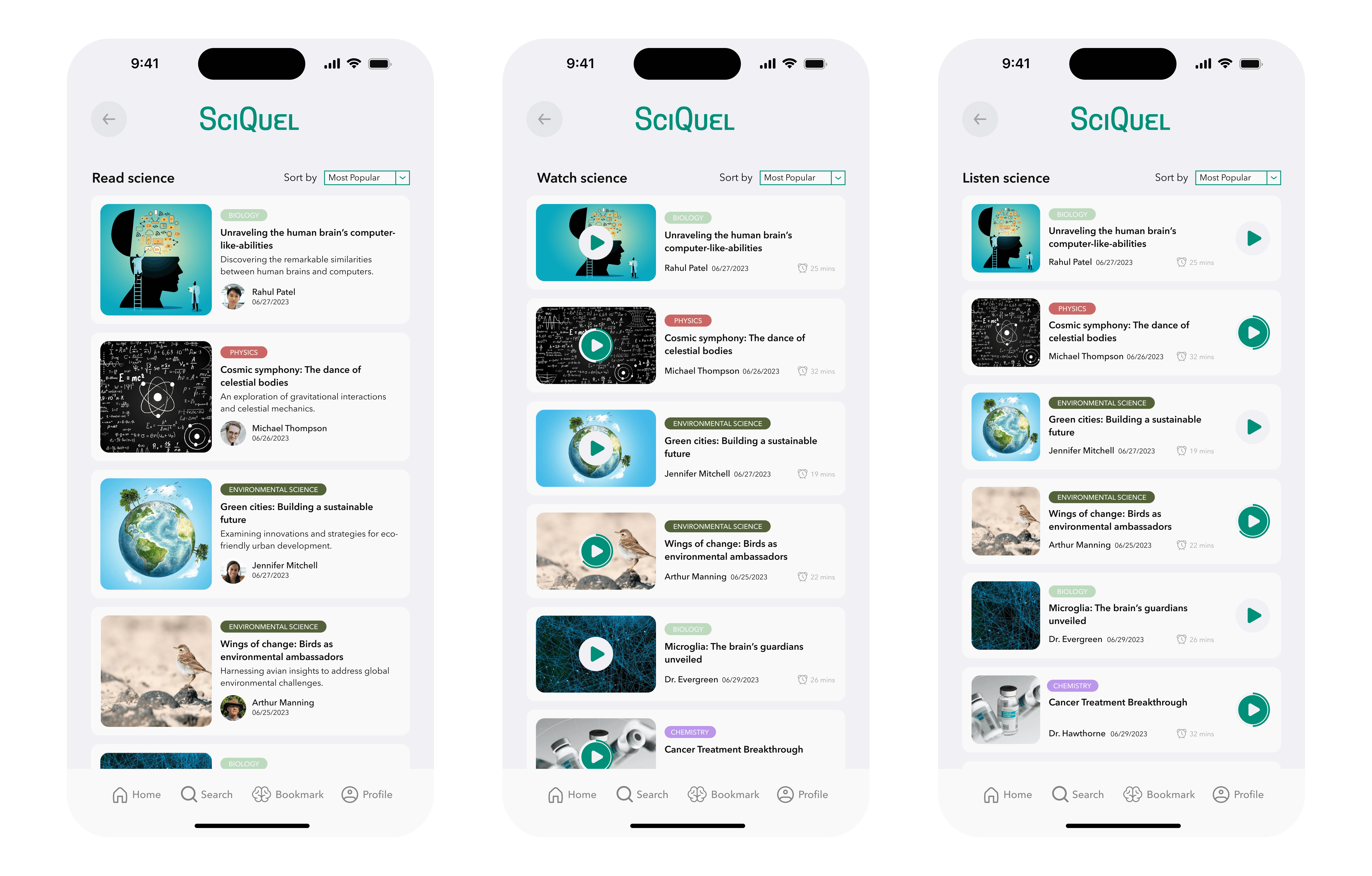
SciQuel delivers curated articles, short explainers, and interactive visuals that break down complex topics into clear, digestible insights. Users can browse by categories such as Biology, Computer Science, and Physics, or explore trending topics through a personalized feed. The design emphasizes readability, visual storytelling, and seamless navigation, enabling users to easily discover, understand, and share science content.
Web Version: https://www.sciquel.org
Project Goals
Enhance Science Literacy: Provide accurate, accessible scientific information to improve public science literacy.
Facilitate Informed Decision-Making: Offer relevant, comprehensible science content that users can apply in real-life contexts.
Foster Engagement and Discussion: Build a platform for meaningful interactions and community participation around science topics.
Deliver a User-Friendly Design: Create intuitive, visually engaging, and seamless interfaces that simplify complex scientific information, ensuring users can easily navigate, interact with, and enjoy the app.
My Roles
Conducted UX research via interviews, usability tests, and A/B testing.
Designed wireframes and interactive prototypes.
Developed user flow diagrams and information architecture for intuitive navigation.
Created user personas and journey maps to guide design decisions and support a user-centered approach.
Performed competitive analysis and market research to identify opportunities and find an edge.
Analyzed research data and presented insights to cross-functional teams to inform design strategy.
Led cross-functional teams to drive innovative solutions.
Coordinated weekly team meetings to track progress and resolve blockers.
Project Overview
Problem
As science and technology increasingly shape our everyday lives, understanding basic scientific concepts and staying informed about new developments is more important than ever. Yet, traditional media often presents scientific information in ways that feel dense, jargon-heavy, or disconnected from daily life—making it challenging for the general public to engage. This gap contributes to low science literacy, limiting people’s ability to make informed decisions, participate in meaningful discussions, and fully appreciate the role of science in society.
Solution
I designed SciQuel, a science news media app, that makes scientific content accessible, engaging, and relevant. The platform curates trustworthy sources, simplifies complex concepts, and uses clear visuals to enhance comprehension. By delivering context-rich, visually engaging, and easy-to-digest content, the app aims to foster curiosity, improve science literacy, and encourage users to explore the world of science with confidence.
Product

SciQuel delivers curated articles, short explainers, and interactive visuals that break down complex topics into clear, digestible insights. Users can browse by categories such as Biology, Computer Science, and Physics, or explore trending topics through a personalized feed. The design emphasizes readability, visual storytelling, and seamless navigation, enabling users to easily discover, understand, and share science content.
Web Version: https://www.sciquel.org
Project Goals
Enhance Science Literacy: Provide accurate, accessible scientific information to improve public science literacy.
Facilitate Informed Decision-Making: Offer relevant, comprehensible science content that users can apply in real-life contexts.
Foster Engagement and Discussion: Build a platform for meaningful interactions and community participation around science topics.
Deliver a User-Friendly Design: Create intuitive, visually engaging, and seamless interfaces that simplify complex scientific information, ensuring users can easily navigate, interact with, and enjoy the app.
My Roles
Conducted UX research via interviews, usability tests, and A/B testing.
Designed wireframes and interactive prototypes.
Developed user flow diagrams and information architecture for intuitive navigation.
Created user personas and journey maps to guide design decisions and support a user-centered approach.
Performed competitive analysis and market research to identify opportunities and find an edge.
Analyzed research data and presented insights to cross-functional teams to inform design strategy.
Led cross-functional teams to drive innovative solutions.
Coordinated weekly team meetings to track progress and resolve blockers.
Project Details
Process

Stage 1. Empathize
Competitive Analysis: Identified key players in the science news space, evaluated strengths and weaknesses, and gathered best practices.

User Interviews: Conducted interviews to uncover desired features and usability preferences.

Stage 2. Define
Key Insights about User Needs
Design Preferences: Clean, modern UI with features like dark mode and consistent styling enhances usability.
Navigation: Users want intuitive navigation with advanced search, personalized dashboards, and clear categorization.
Content Format: Visual and multimedia elements help simplify complex topics.
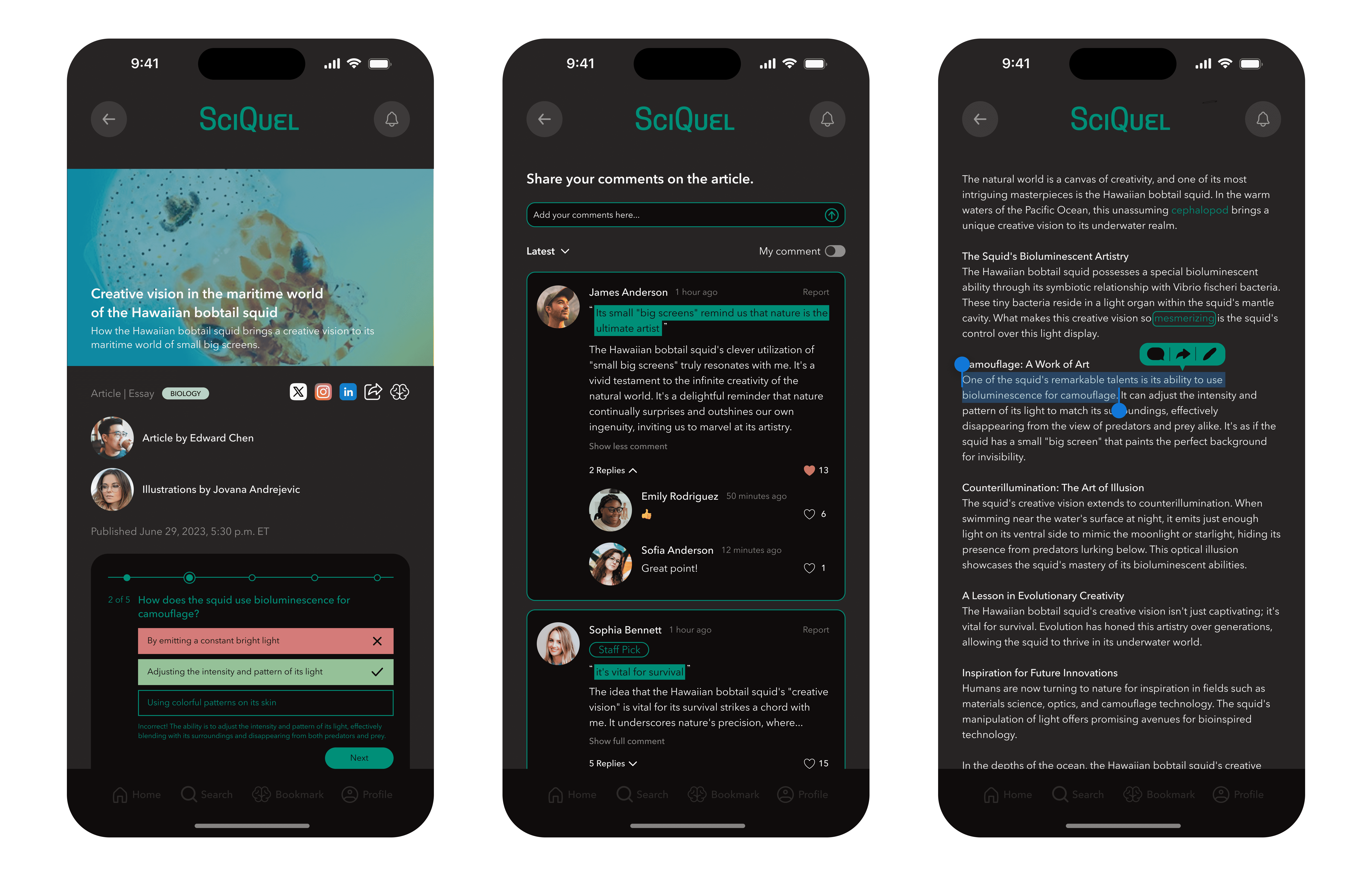
Engagement: Quizzes, comment sections, and sharing options strengthen community interaction
User Stories & Personas: Created two personas with their stories (goals, pain points, preferred features, and technology uses) to guide design priorities and ensure relevance to target users.

User Journey Map & User Scenario: Visualized the user’s emotional and behavioral journey from frustration with existing apps to a seamless experience using the redesigned app. This scenario highlights how the new design addresses user pain points, supports goal completion, and creates a more satisfying and efficient experience.

Stage 3. Ideate
Conceptual Diagram: Modeled the conceptual structure of the app, illustrating how content delivery, personalization, engagement, learning, and accessibility systems interact to support users’ scientific exploration. The diagram reflects the app’s user-centered strategy—helping users discover, understand, and engage with science in a personalized and inclusive way.

Design Concepts for SciQuel
A Clean & Modern Interface: Minimalist design that keeps content in focus.

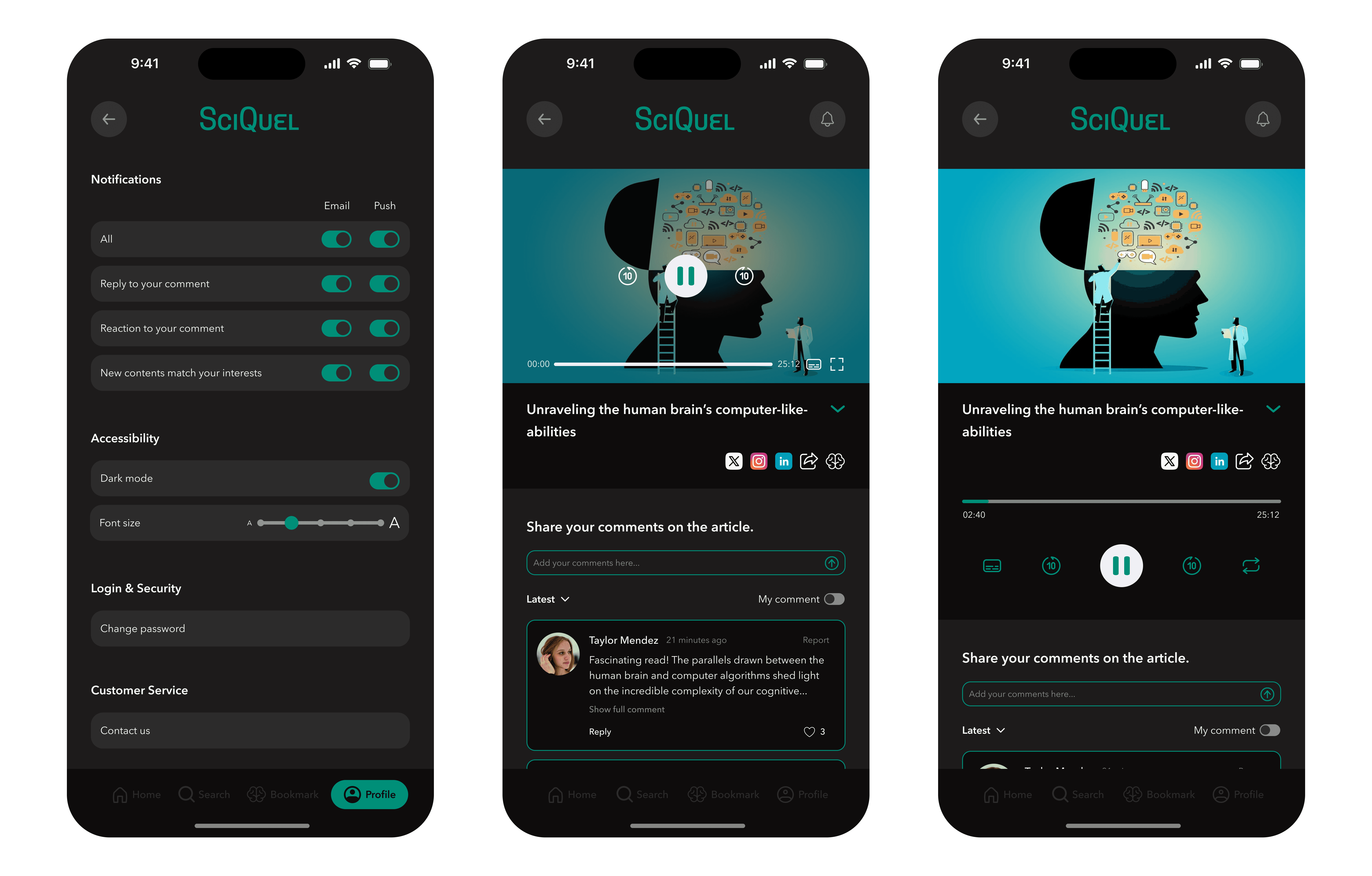
Accessibility Features: Dark mode, adjustable fonts, and video subtitles.

Customizable Content Feed: Personalized recommendations by topic or interest.

Engagement Tools: Quizzes, discussion threads, highlights, and social sharing.

Rich Multimedia Integration: Articles, videos, audio, and photo galleries.

Information Architecture & Sitemap: Mapped the app’s information architecture by integrating the sitemap with content and feature structures to reflect the underlying user experience strategy. This framework clarifies how users discover, access, and interact with information—ensuring a logical flow that supports intuitive navigation and meaningful engagement.

User Flow Diagram: Illustrated the complete journey for common user tasks.

Design System
Logo Design

Typography & Color Palette

Design Assets

Stage 4. Prototype
Wireframes: Created sketches and digital wireframes to visualize layout and functionality, identifying usability issues early.

Prototypes: Built and refined interactive prototypes for testing core features and navigation flows.

Stage 5. Test
A/B Tests: We conducted A/B tests to evaluate design hypotheses and identify the variation that best enhanced the user experience. The insights guided our iterations and ensured decisions were backed by user behavior.

User Acceptance Testing & Usability Testing: We conducted user acceptance and usability tests to validate that the product functioned correctly in real-world scenarios and identify usability issues, ensuring it effectively met user needs and business requirements. Each round involved five participants. After the first round, we analyzed the findings, developed new design solutions, and refined the prototypes. Using the updated prototypes, we then conducted a second round of testing.
First Round
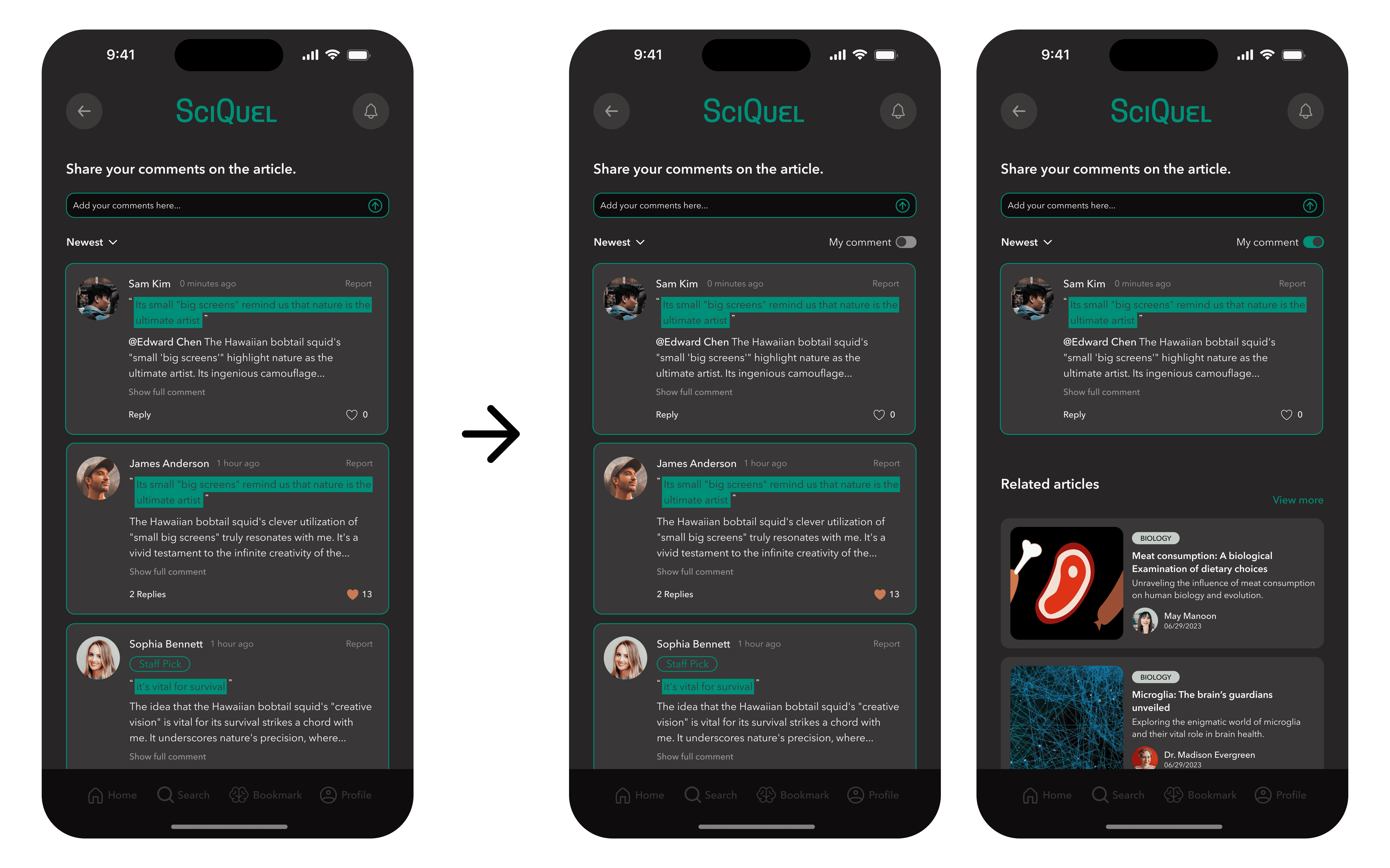
⚠️ Issue 1: Users could not easily find their previous comments.
🛠️ Solution: Added a filter for locating past comments.

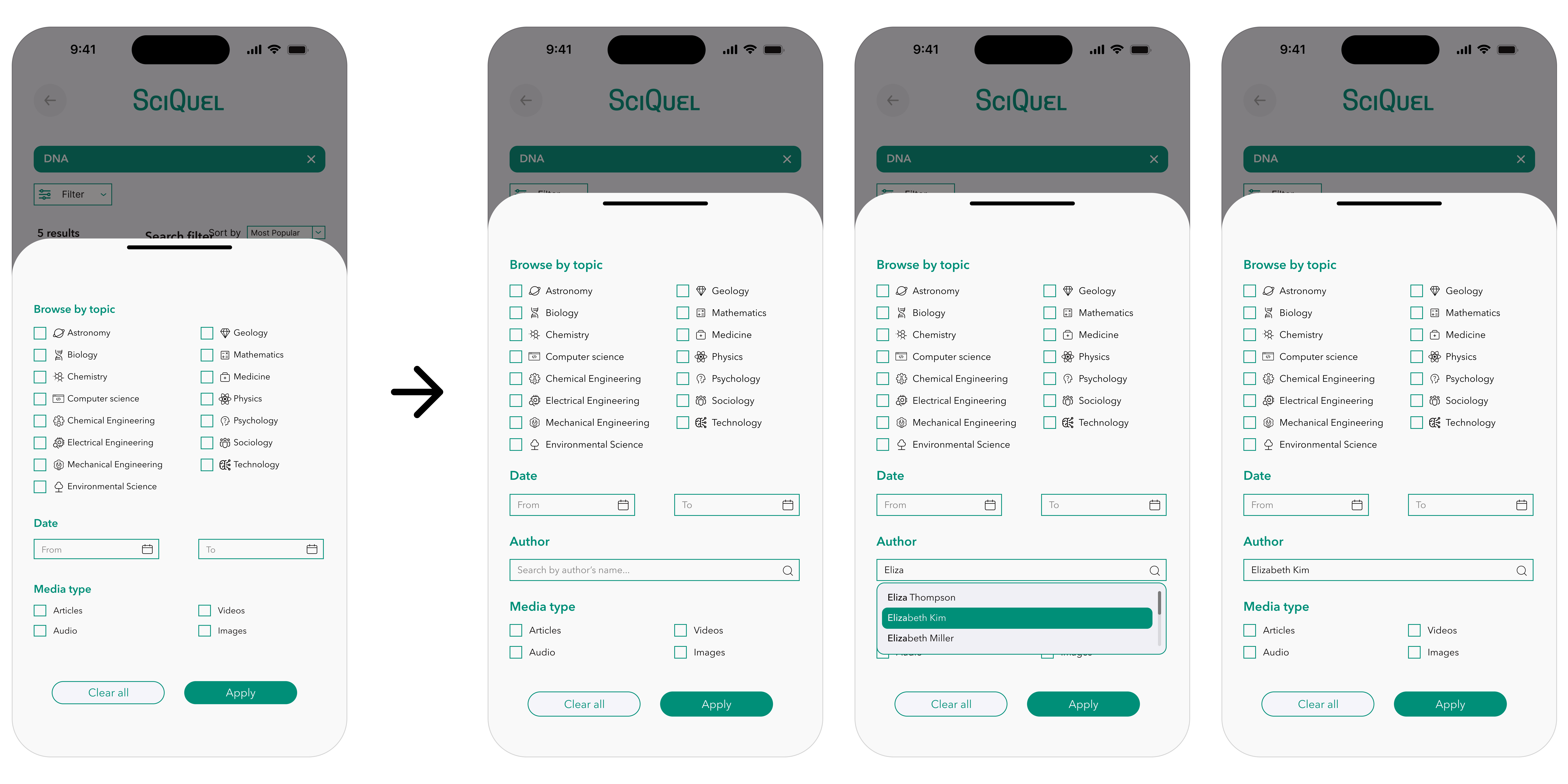
⚠️ Issue 2: Users wanted to search by author name.
🛠️ Solution: Introduced the author name filter in search

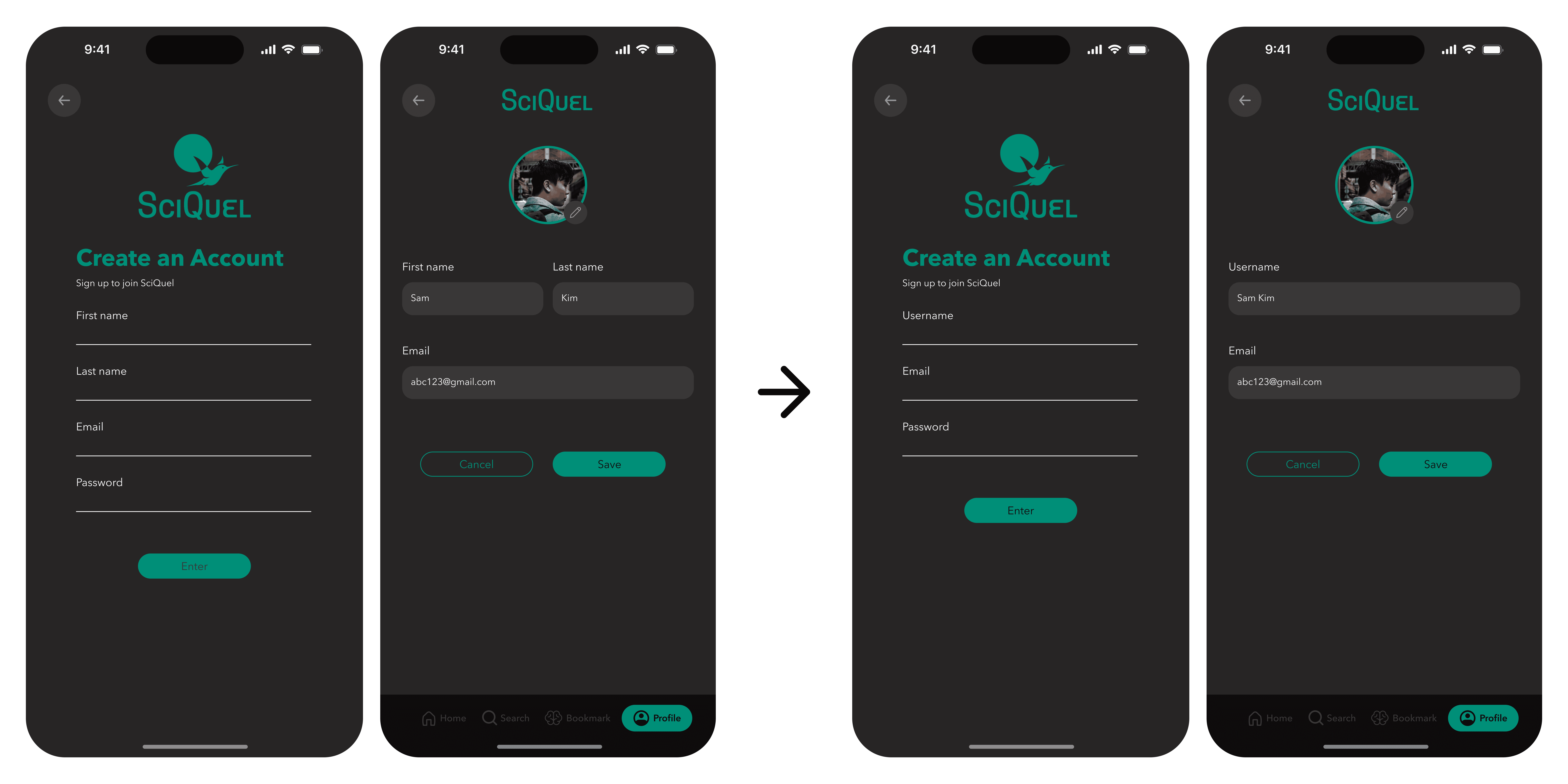
⚠️ Issue 3: Account creation required full names, raising privacy concerns.
🛠️ Solution: Allowed usernames instead.

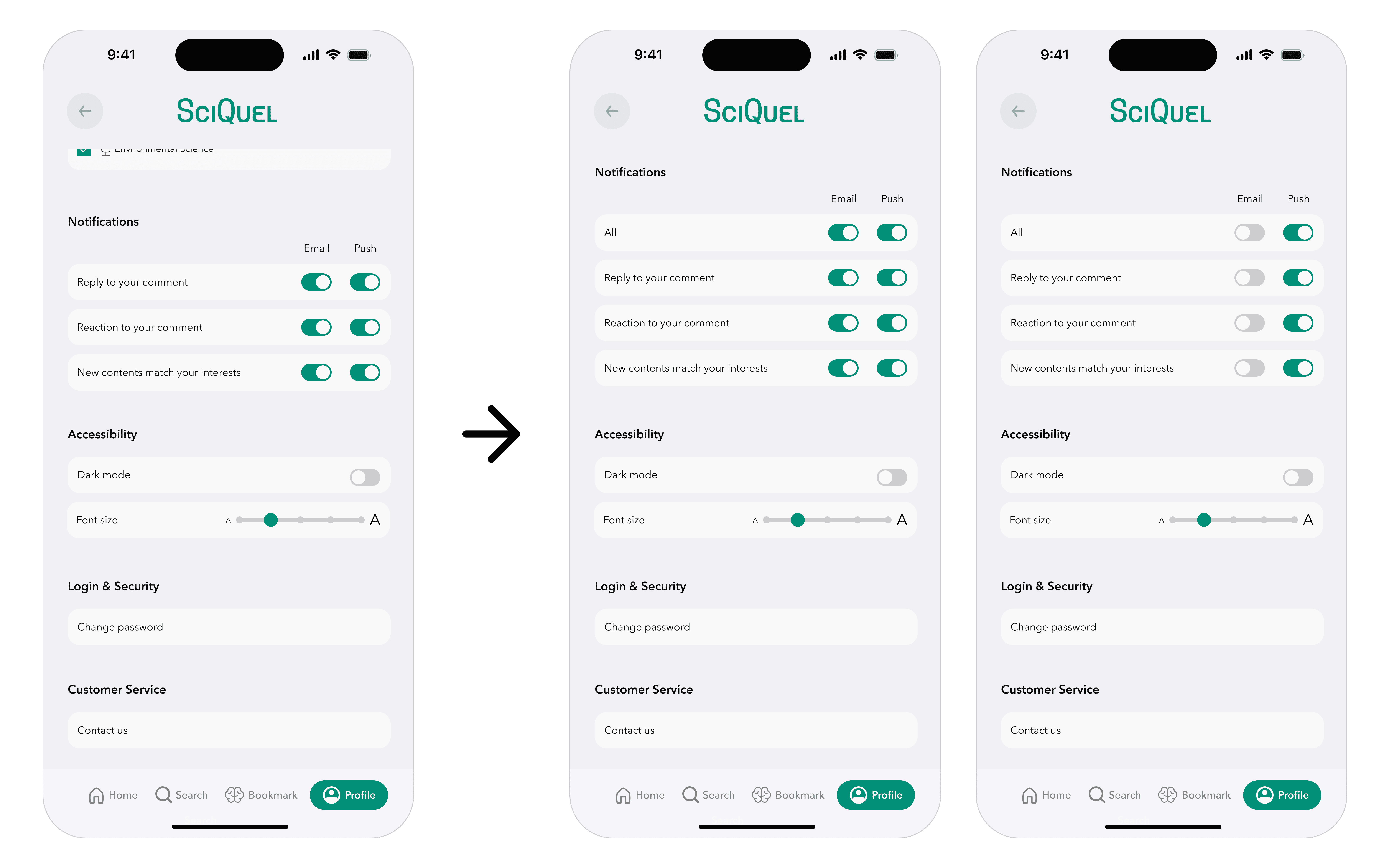
⚠️ Issue 4: Managing notifications was cumbersome.
🛠️ Solution: Added master toggle to enable/disable all notifications at once.

Second Round
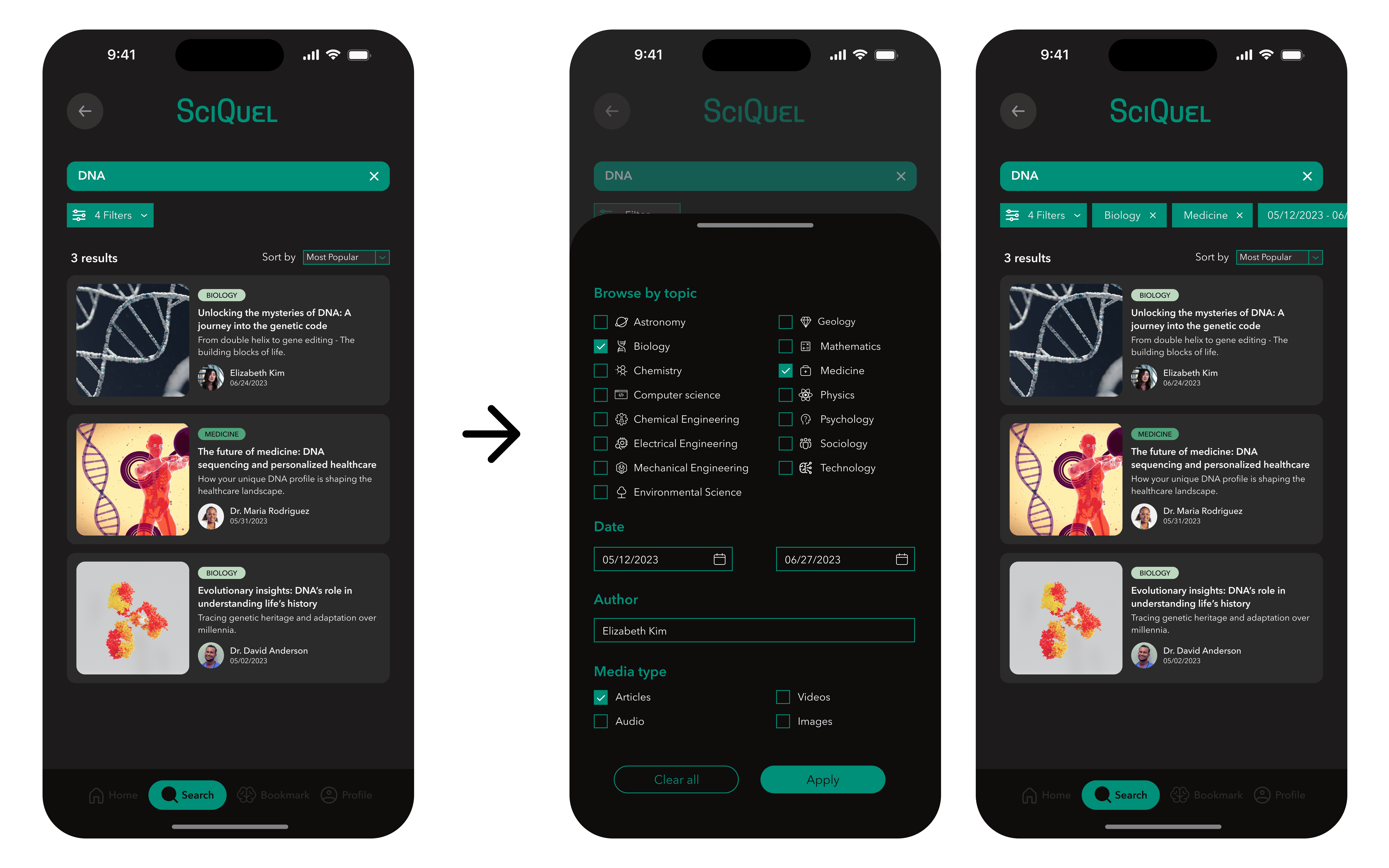
⚠️ Issue 1: Active filters were not visible without reopening the filter menu.
🛠️ Solution: Displayed active filters prominently on results pages.

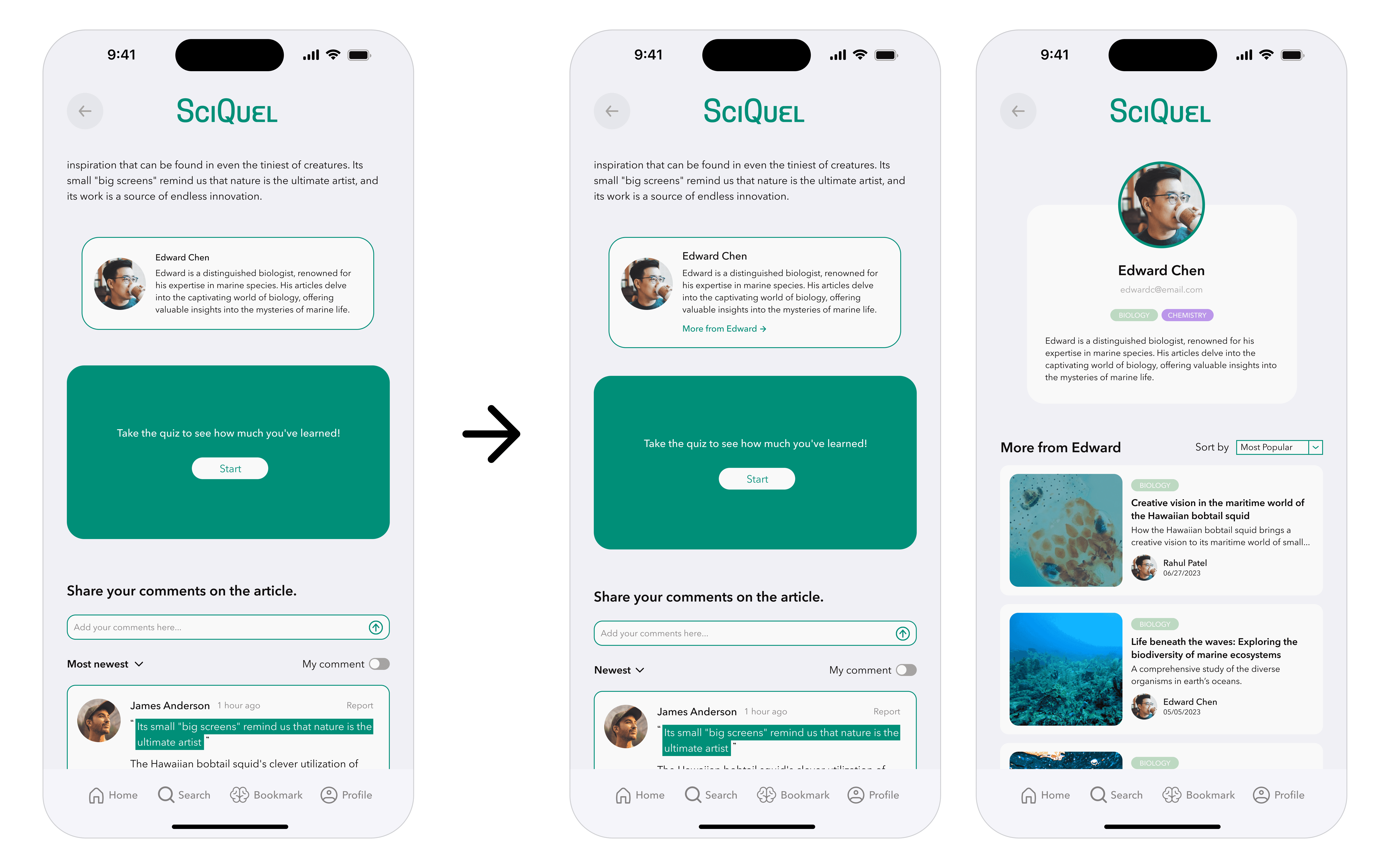
⚠️ Issue 2: Author bios were at the bottom of articles, making it hard to find related works.
🛠️ Solution: Added "More from Author" button to bio section.

Heated Maps: After participants fully explored the app, they were asked to save content and retrieve saved items. Using Maze, we tracked their behaviors and interactions to analyze navigation patterns and identify usability challenges. Heatmaps visualized engagement and revealed moments of confusion or hesitation, providing actionable insights that informed iterative design improvements.

Updated Prototypes


